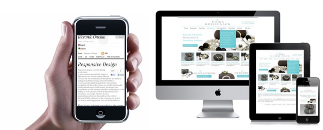
Responsive Web Design: A Primer from the Developer

No question about it, the world is changing. The way we daily interact with each other has changed dramatically in the past few years.
I remember my first WAP-enabled mobile phone. It was simply amazing. Not only could I send SMS messages and make calls from virtually anywhere, I could even check my email and browse the web. Sort of.
The WAP phones back then didn’t do a very good job of presenting the data in a visual pleasing manner, so the need to create websites specifically for these devices was still in the distant future.
However, the future is now. Not only have smartphones changed the way our clients view their projects, they have really catapulted the phrase “responsive web design” into the forefront of progressive design studios research and website planning.
From the iPhone and iPad, to the numerous Android devices and flavors, the way we view a website online may easily change many times in any given day. So, one of my jobs here at DCGWS is to ensure the absolute best user experience across as many devices as possible. Easy job? Not at all. But not only is it recommended, but given the number of smartphone/tablets users today (me included), it is no longer optional. For example, in my office, I use a 27″ iMac, an 11″ MacBook Air, an iPad 2 and an iPhone 4S. So, I figure that if I use this many devices everyday, so do my clients. And they do.
One of the highlights in our website planning meeting, whether it be face-to-face or virtual (via Skype), is determining the clients’ target market and how our website design will respond to different devices.
Below, here is an example of great responsive design, by one of my favorite sites, Smashing Magazine:

The topmost image is how the site looks on my 27″ iMac.
Below that is from my 11″ MacBook Air. Notice how the far-left sidebar, as the screen gets smaller, is displaced and moved to the top menu area, saving much needed space.
The image below that is my iPad 2 in landscape mode. Not much change.
But then, the last image is from my iPhone 4S. Notice the changes? I think this is a very good example how you can be responsive to numerous devices without loosing effectiveness.
Whether it be PSD to HTML, PSD to WordPress, or a custom web design package – if you require a responsive website that can adapt to your users’ many devices, please rest assured that I’ll personally see to it that we get it done just perfectly. Please, let us know how we can help!


This Post Has 0 Comments